Skip to content

Case Studies

Giving the Heartland Franchise Guy something to talk about.

A BRAND STORY

Blake Martin knows a thing or two about finding the right fit. As a franchise consultant with FranNet of the Heartland, he describes himself as the Match.com for local entrepreneurs and corporate refugees. He helps people explore business ownership, discover opportunities, and find a franchise that fits their goals.

But when it came to the visual identity for his Heartland Franchise Guy podcast, Blake hadn’t found the right match.

He had already worked through two versions of a logo with another provider. Neither captured what he envisioned. In fact, he was reluctant to promote the podcast because he wasn’t happy with how it looked.

For someone whose business revolves around helping people find the right opportunity, it was time to find the right identity.


A corny idea

When Blake approached Brandscapes, he wanted a logo that could stand on its own. It needed to work on podcast platforms, websites, apparel, and promotional materials. More importantly, people needed to recognize immediately that Heartland Franchise Guy was a podcast.

The microphone was an obvious starting point.

The Heartland part inspired something a little less obvious.

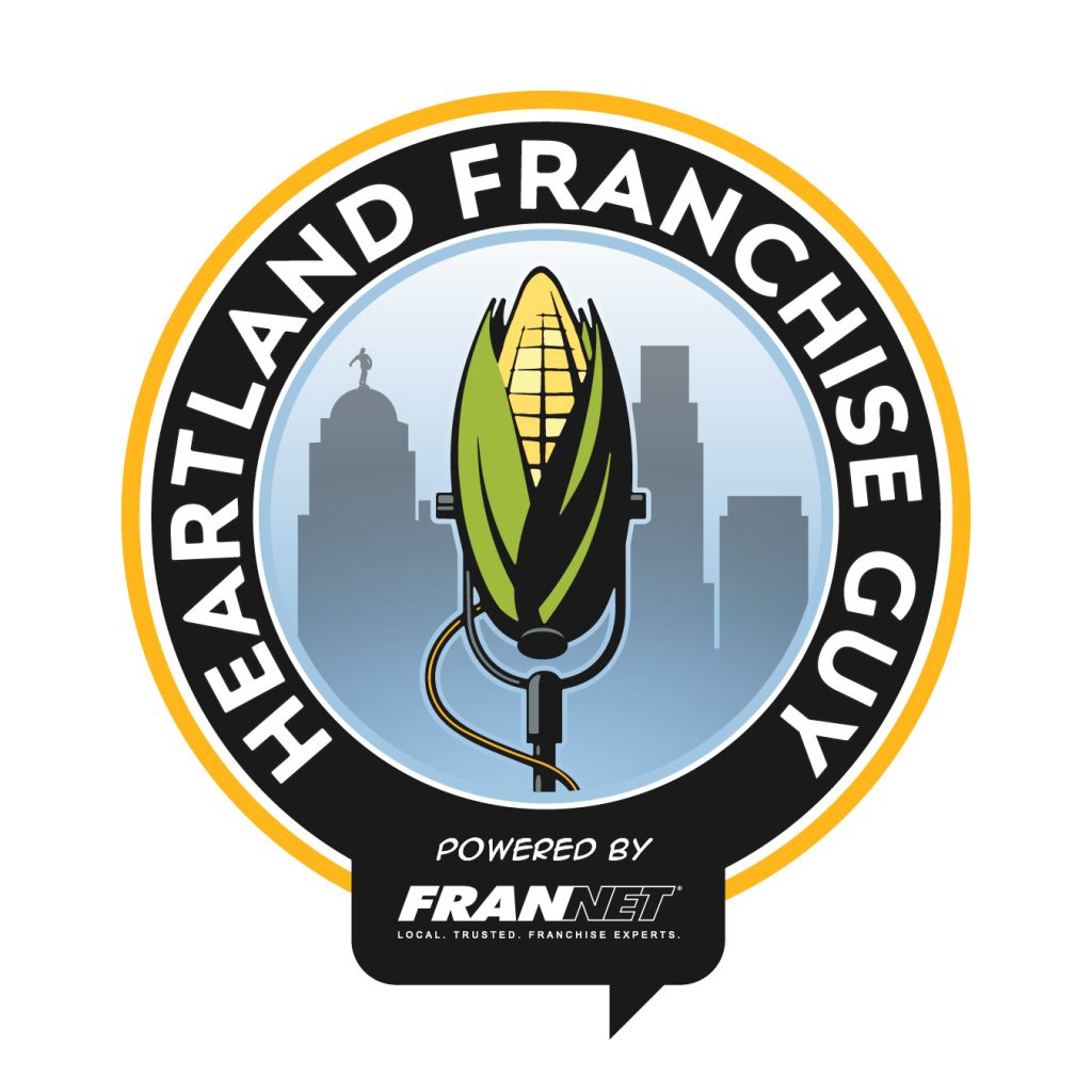
What if the microphone was an ear of corn?

It was a playful idea, combining two recognizable symbols into one. Early sketches explored a corncob microphone rising above the Omaha skyline, surrounded by bold lettering and colors drawn from FranNet’s established identity.

The first concepts were distinctive, colorful, and unmistakably Midwestern.

Blake appreciated the direction but saw a potential problem.

Although the word Heartland was in the name, his podcast wasn’t about agriculture. It was about entrepreneurship, small business ownership, and the people willing to take a chance on themselves.

He wanted to eliminate the corn but keep the microphone.

It was an important distinction, and it changed the direction of the design.


Client: Blake Martin, Heartland Franchise Guy

Client Services: Franchise Consulting, Business Ownership Guidance, Entrepreneurship Education, Podcasting

Brandscapes Services: Visual Brand Identity, Logo Design, Creative Direction, Brand Development, Brand Asset Management

Burning the midnight oil

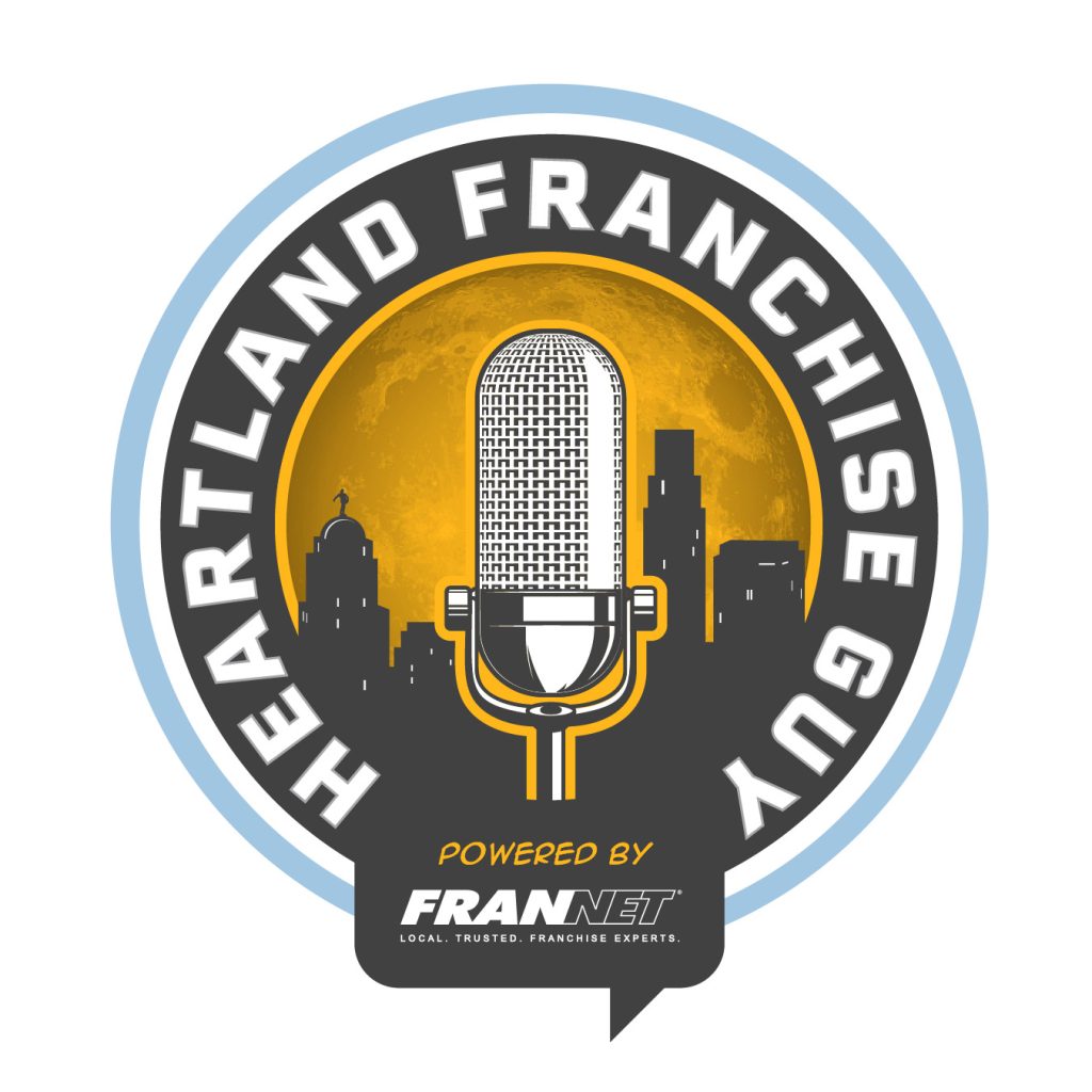
With the corn removed, Brandscapes began exploring a more traditional broadcast microphone against the Omaha skyline.

But the skyline wasn’t intended to be just a geographic reference.

During the creative discussions, Blake talked about corporate refugees and serial entrepreneurs. People looking for a different future. People considering leaving established careers to pursue the independence and opportunity of business ownership.

That conversation inspired another visual element.

A city skyline at night, with lights glowing in selected windows.

Somewhere behind those windows were people burning the midnight oil, working on ideas, researching opportunities, and imagining what their next chapter might look like.

Early versions featured a crescent moon, while others explored stars and different nighttime color treatments. Even the number of illuminated windows received consideration, as Brandscapes looked for a subtle way to represent the relatively small percentage of people pursuing entrepreneurship.

It wasn’t necessary for someone to recognize every detail to appreciate the logo. But those details gave the artwork a story of its own.

The microphone represented the podcast. The skyline represented the community. The illuminated windows represented the people Blake hoped to reach.

And the Heartland was still there, without a single ear of corn.


Finding the right fit

As the identity evolved, several design directions emerged.

Circular badges gave way to more distinctive shapes. Typography was refined for legibility. Colors were explored, adjusted, and compared. The relationship between the Heartland Franchise Guy name and the Powered by FranNet endorsement received particular attention.

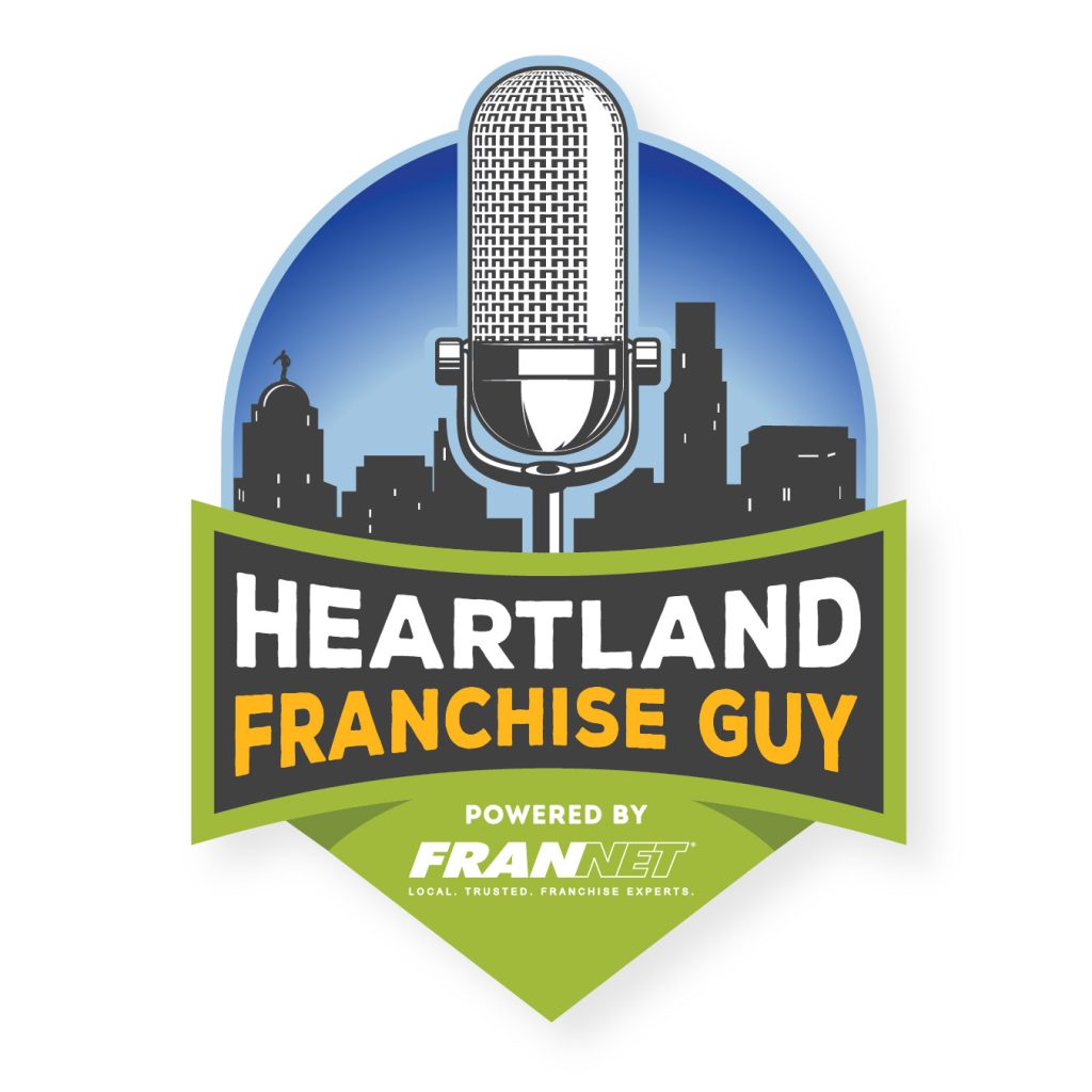
The eventual direction combined a prominent vintage broadcast microphone, a recognizable city skyline, bold lettering, and a green geometric base that subtly reinforced the Heartland connection.

It was professional without feeling corporate. Regional without relying on agricultural clichés. And recognizable as a podcast without needing an explanation.

By early May, Blake had selected the winning design, including a final refinement to the FranNet lettering that better connected it visually to the rest of the identity.

After the final artwork was delivered, Blake responded with a simple message:

“Thank you John, great work!”

More importantly, he finally had a podcast identity he could feel good about putting in front of people.


The logo was finished. The work wasn’t.

A few weeks later, Brandscapes noticed something wrong.

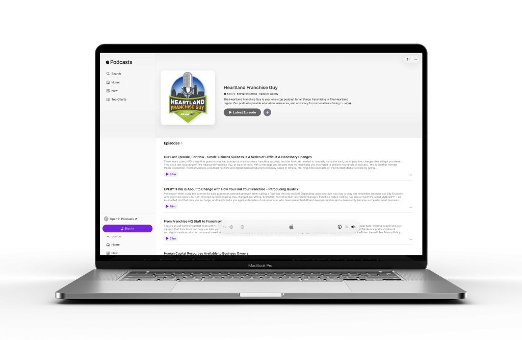
The podcast’s production and distribution partner, Hurrdat Media, had placed the logo into a square format that stretched the artwork horizontally. The carefully developed proportions were distorted.

Brandscapes prepared new square-format files, provided replacement artwork, and followed up directly with Hurrdat to help ensure the identity appeared as intended.

Because a logo that looks right when it leaves the designer’s desk should still look right when it reaches the audience.

That attention continued weeks later when Blake wanted to reproduce the identity on a Solo Stove fire pit. The detailed artwork needed adjustments for laser engraving, including heavier elements and simplified details that would reproduce more reliably.

Brandscapes worked through those production considerations, helping preserve the identity while adapting it to an entirely different medium.

From podcast artwork to promotional merchandise, the objective remained the same: keep the brand recognizable, consistent, and properly represented.

CONTINUE READING ABOUT THE BRANDSCAPES EXPERIENCE

Is your brand ready for a transformation?