Sometimes a company outgrows its logo long before it realizes it.
Pan American Lubricants had built its business supplying specialty lubricants for industrial and commercial applications, including food-grade products used in bakeries and food-processing facilities.
The company understood its products, its customers, and the demanding environments where those products needed to perform.
But its visual identity told a narrower story.
The existing logo featured a globe, a stalk of wheat, and traditional lettering. It reflected the company’s roots in food-related industries, particularly commercial baking.
There was nothing inherently wrong with that connection.
The problem was that Pan American Lubricants did considerably more than serve bakeries.
Its products and potential markets extended into manufacturing, agriculture, transportation, construction, and other industrial applications.
And the company wanted an identity that reflected those opportunities.
That was where Brandscapes came in.
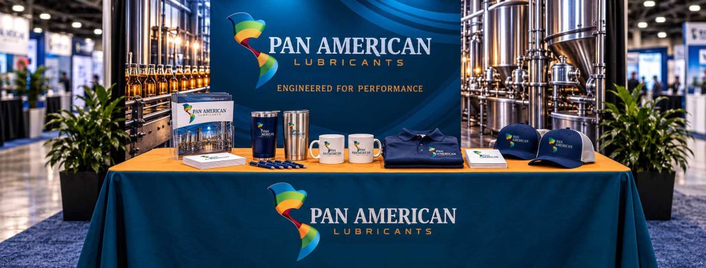
It started with a trade show table
Jeffrey Coleman, the person behind Pan American Lubricants, initially approached Brandscapes about something fairly straightforward.
He needed a new covering for a trade show table.
He had photographs of the existing display, brochures, and a logo he was considering modifying.
His thought was to replace the wheat imagery with something more mechanical, perhaps incorporating a gear into the globe.
It made sense.
A gear would communicate machinery. The globe would preserve the company’s international positioning. And the result would move the identity away from its agricultural associations.
But there was another possibility.
Instead of trying to make the existing logo say something different, why not reconsider what the logo needed to communicate in the first place?
The challenge wasn’t simply replacing wheat with machinery.
It was creating an identity that could represent the company’s entire business without being tied to any one industry.
A different way to see the Americas
The name Pan American Lubricants already carried a powerful idea.
North America. South America. Markets connected across borders.
The opportunity was to communicate that reach without falling back on the familiar imagery of globes, gears, and oil drops.
Brandscapes explored several visual directions.
One concept stood apart.
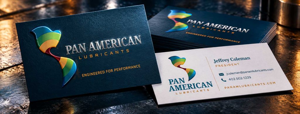
Rather than illustrating the world literally, the design used a continuous, flowing shape to suggest the connection between North and South America.
It was recognizable without being obvious.
The form communicated movement, energy, and distribution while retaining a subtle geographic reference.
It also gave the company something its previous identity lacked: a distinctive symbol that could stand on its own.
Brandscapes recommended Option B.
Jeffrey liked it, too.
But he had one concern.
The colors.
Not quite a rainbow
The original color treatment was intentionally broad, reflecting the diversity of products, markets, and industries served by Pan American Lubricants.
Jeffrey wondered whether the combination was getting a little too close to a rainbow.
It was a fair observation.
Color can communicate energy and variety, but it can also change how seriously an identity is perceived, particularly in an industrial market.
The goal wasn’t to make the company look colorful.
It was to make the company look established, capable, and ready to compete across multiple industries.
Brandscapes refined the palette, introducing deeper blues, greens, earth tones, and golds to give the mark a more industrial character.
The flowing shape remained.
That was important.
The design wasn’t intended to represent a specific lubricant, machine, or manufacturing process. It represented the company’s reach and the movement that connects its markets.
The refined identity retained its energy while becoming more appropriate for the customers Pan American Lubricants wanted to reach.

Client: Pan American Lubricants
Client Services: Industrial Lubricants · Food-Grade Lubricants · Specialty Lubrication Products · Industrial Cleaning Products
Brandscapes Services: Brand Strategy, Logo Development, Brand Identity, Brand Guidelines, Typography, Corporate Stationery, Tagline Development, Marketing Strategy & Recommendations
The details make the difference
A good logo is only the beginning of a recognizable brand.
The typography needed to complement the new symbol without competing with it.
Brandscapes developed a combination of traditional and contemporary letterforms.
Noto Serif Condensed Bold gave the Pan American name a sense of authority and permanence.
A customized version of Ronduit Capitals provided a more technical, industrial character for the word Lubricants.
Eurostile was selected as a complementary typeface for supporting communications.
Together, they created a balance between established credibility and modern industrial performance.
The same attention went into the colors, logo configurations, and applications.
The identity needed to work on a website, business card, letterhead, trade show display, company vehicle, or embroidered shirt.
Some applications required a horizontal logo. Others needed a stacked version. Still others required simplified, single-color artwork.
Brandscapes developed comprehensive brand guidelines to establish those standards and make future applications consistent.
The guidelines documented approved logo versions, control areas, color specifications, typography, and examples of how the identity could appear across different materials.
Even the tagline received attention.
Rather than settling for something generic that could describe almost any lubricant supplier, Brandscapes recommended language that reinforced the company’s technical positioning.
Engineered for Performance.
Three words that connected the company’s products with what its customers actually needed.
Reliability.
Consistency.
Performance.
A new identity creates new opportunities
Once the visual identity was established, the conversation moved beyond how Pan American Lubricants looked.
The next question was how to help the company reach more of the right customers.
Pan Am already supplied food-grade lubricants to businesses such as bakeries, meat processors, and beverage companies.
Those relationships provided something valuable.
A starting point.
Rather than recommending an immediate push into every possible industry or geographic market, Brandscapes developed a marketing opportunities report built around measured expansion.
The approach was straightforward.
Start with industries the company already understands.
Make its product information easier to find.
Identify more businesses that resemble existing customers.
Test a few opportunities before committing significant resources.
One recommendation was to organize the company’s product data sheets into an accessible online library.
Instead of relying on printed sheets, customers and prospects could find the technical information they needed directly through the website.
Industry-specific pages could explain how Pan Am products serve bakeries, meat processors, and other manufacturing environments.
Those pages could also provide destinations for search advertising and direct sales outreach.
Brandscapes recommended testing Google advertising in markets where Pan Am already had customers, rather than immediately pursuing unfamiliar territories.
The report also explored opportunities to identify prospective customers through industry associations and trade show information.
A trade show booth can be expensive.
Researching the companies attending or exhibiting at that show can provide another way to identify potential customers before making that investment.
Additional opportunities included the pet food manufacturing industry and potential distributor relationships.
None of these recommendations required Pan Am to do everything at once.
That was the point.
Knowing where to go next
The new identity gave Pan American Lubricants a more accurate way to present itself.
The marketing recommendations provided a framework for deciding where to focus next.
They were separate parts of the same larger challenge.
A company with specialized products and industry experience needed to communicate its capabilities more effectively, then find practical ways to introduce those capabilities to new customers.
Brandscapes’ role was to help connect those pieces.
Not simply to make the company look different.
But to help its appearance, positioning, and marketing direction reflect the business it had become—and the opportunities ahead.
The original request had been for a trade show table covering.
The result was a much broader conversation about the company’s future.
Sometimes that’s where the most valuable branding work begins.