American Fence Company had spent years building its reputation in the fencing industry.
As part of an established franchise organization with 18 locations, the team had developed the experience, industry knowledge, and customer relationships needed to build a successful fencing business.
But its ambitions were beginning to reach beyond operating as a franchisee.
The company saw an opportunity to take what it had learned and build something of its own. Instead of operating under someone else’s franchise brand, it wanted to become the franchisor, creating a national network of independently owned fencing businesses under a new identity.
There was just one problem.
The name it had been operating under couldn’t follow it.
Trademark and common-law restrictions meant the American Fence Company name wasn’t available for its new national franchise operation.
So the company needed something new.
Not just a different name, but an independent brand capable of carrying the same experience, craftsmanship, and values into markets where nobody knew the people behind it.
It needed to sound established from day one. Strong enough to compete nationally, approachable enough to appeal to homeowners, and credible enough to attract prospective franchise owners.
And it still needed to feel American.
That was the challenge Brandscapes was asked to solve.
Client: ValorBuilt Fence
Client Services: Residential Fencing, Commercial Fencing, Gates, Access Controls, Fence Materials
Brandscapes Services: Brand Strategy, Naming, Domain Research, Preliminary Trademark Research, Logo Development, Brand Identity, Brand Guidelines
Finding a name that could go anywhere
Naming a company is difficult enough. Naming one that needs to work across the country, appeal to two very different audiences, and avoid existing trademarks makes the process considerably more complicated.
There were plenty of patriotic words that sounded promising.
But sounding good wasn’t enough.
A name needed to be memorable, easy to spell, and natural to say. It had to work on everything from a business card to a fleet of trucks. It also needed a viable domain and enough distinction from existing businesses to warrant further consideration.
And it couldn’t limit the company’s future.
Residential fencing would be the initial focus, but commercial installations, gates, access controls, and material sales were all part of the longer-term picture.
After researching dozens of potential names, Brandscapes narrowed the options based on memorability, relevance, domain availability, and preliminary searches of the United States Patent and Trademark Office database for existing registrations.
Each candidate needed to be more than a good idea. It needed the potential to become a recognizable national brand without immediately encountering naming or domain conflicts.
From those carefully researched options, the company selected ValorBuilt Fence as the name for its new independent franchise brand.
Valor brought a sense of courage, integrity, and pride. Built connected those qualities to craftsmanship, construction, and the lasting nature of the company’s work.
Together, the words created something that felt familiar without being generic.
It was patriotic without relying on the word American. Strong without being intimidating. And broad enough to represent more than a single fencing product or service.
Most importantly, it was a name that could establish its own reputation.
Now it needed an identity to match.
Sometimes the first idea is worth another look
Creating the logo wasn’t quite as straightforward as choosing the name.
Brandscapes developed several visual directions, exploring ways to communicate strength, American heritage, and the company’s connection to fencing.
Some incorporated flag-inspired elements. Others used geometric shapes, letterforms, and subtle references to fence construction.
The initial concepts generated discussion, but not immediate agreement.
Certain designs felt too close to established brands. Others were considered too abstract or didn’t communicate the company’s services clearly enough.
So the exploration continued.
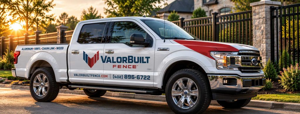
New concepts were developed, different typography was considered, and the team evaluated how each direction might work across vehicles, signage, print materials, and digital applications.
Interestingly, after several rounds of exploration, the company returned to one of the earliest ideas.
A bold V constructed with visual references to fencing.
It had been there almost from the beginning.
But the process of exploring alternatives helped clarify why it worked.
Sometimes creative development isn’t about finding something entirely new. It’s about exploring enough possibilities to recognize the strength of an idea that was already there.
Making a strong idea stronger
Returning to the original direction didn’t mean the work was finished.
The V needed refinement.
The company wanted an identity that felt patriotic without being overly decorative, strong without appearing aggressive, and modern without losing the sense of craftsmanship behind the business.
Early versions incorporated stars, reinforcing the American heritage of the brand. But as the design evolved, the decision was made to remove them.
The cleaner mark was more versatile, particularly at smaller sizes where intricate details can disappear.
Typography received the same attention.
Different letterforms, weights, and proportions were explored to find the right balance between the symbol and the name. The final direction used strong, geometric sans-serif typography that complemented the structure of the V without competing with it.
Even the relationship between the words ValorBuilt and Fence mattered.
For a new national brand, customers needed to understand what the company did before they had developed any familiarity with its name.
The word Fence couldn’t become an afterthought.
As the design evolved, the final direction took shape: a distinctive V, confident typography, and a restrained red, white, and blue palette.
The identity had the strength the company wanted, without unnecessary complexity.